Japan has lost one of its most profound visual storytellers. Kazumasa Nagai, the visionary designer behind the identity of the 1972 Sapporo Winter Olympics and the logos of major companies including Asahi Breweries, Mitsubishi UFJ, Japan Railways and Nissin, passed away on February 23. He was 96. His agency shared the news on Monday, noting he died of acute respiratory failure.
Born in Osaka, Nagai was driven by a constant urge to evolve. He left Tokyo University of the Arts in 1951 to pursue his own creative path, and in 1960 became a founding member of the Nippon Design Center — a pivotal step that helped usher in a golden age of Japanese advertising and proved that commercial art could possess real depth.
While he built the visual identities of massive corporations, Nagai always maintained a personal touch in his works. In his later years, he stepped away from rigid, mechanical lines to create the acclaimed “Life” poster series (1990 onward) — a collection of hand-drawn animals and plants that brought a sense of wonder and warmth to an increasingly digital world.
For Nagai, design was never merely technical. “No matter how much technology advances and how many things change, communication is the act of a human being passing information to another human being,” he once said.
Over his long career, Nagai’s excellence was recognized with some of the country’s highest honors. He received the Medal with Purple Ribbon in 1989 and the Order of the Rising Sun, Gold Rays with Rosette, in 1999.
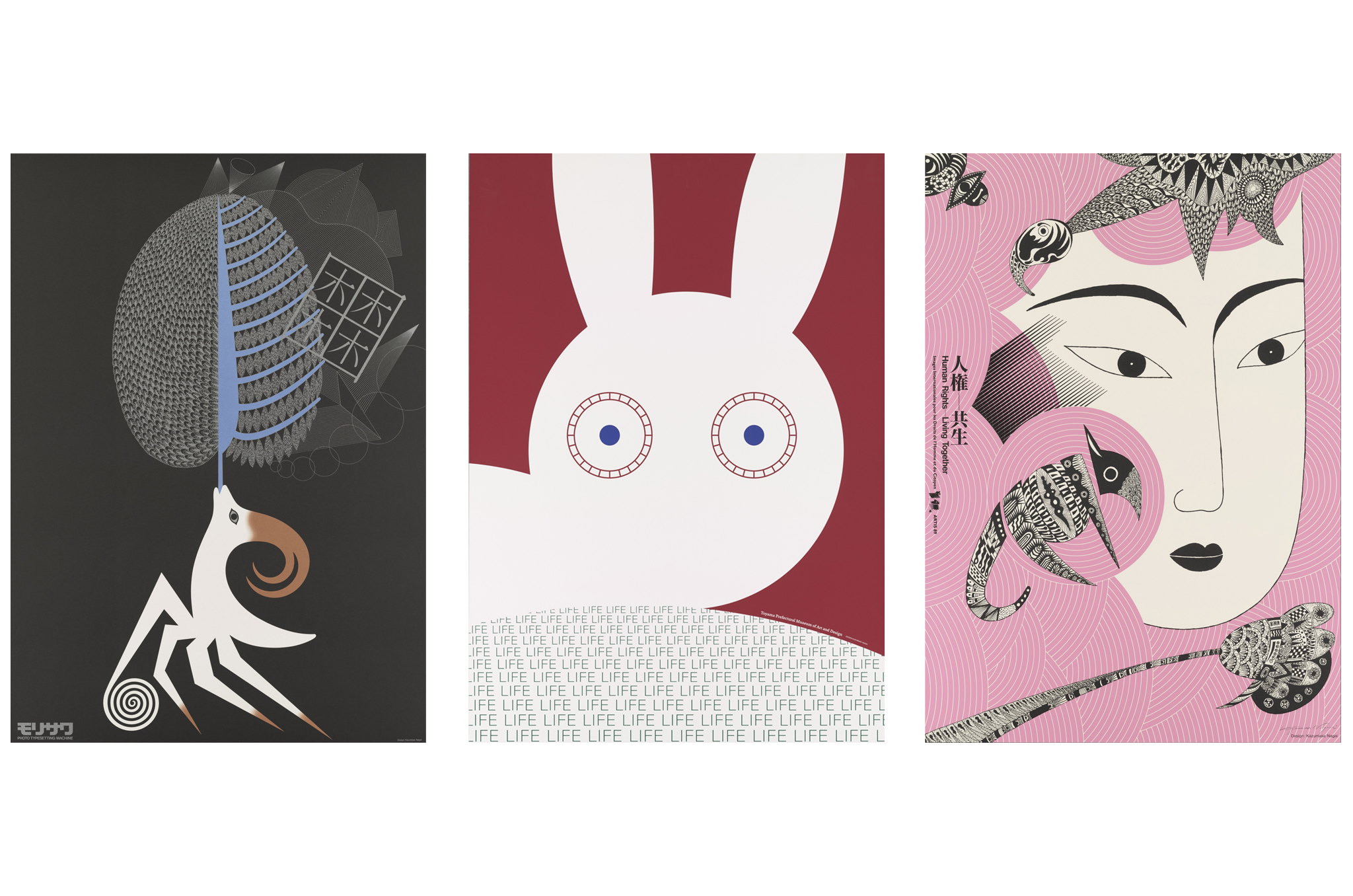
Nagai’s “LIFE” series | c/o the artist’s “From Now To Eternity” Retrospective (2022)
Symbols with Souls
Nagai’s genius lay in his ability to use traditional Japanese aesthetics to explain modern technology to the world. A prime example is his 1964 poster series for Nikkor (Nikon) lenses. While the rest of the world was using literal photography to sell cameras, Nagai used hypnotic, concentric circles and rigorous geometry to visualize the abstract movement of light through glass. Its minimalism and poetry were revolutionary at the time.
He applied a similar philosophy to the 1972 Sapporo Winter Olympics emblem, a vertical stack of three simple elements: a snowflake, a circular sun motif and the Olympic rings. The snowflake itself was a stylized take on a traditional family crest, while the verticality serves as a nod to the traditional Japanese writing system, which reads from top to bottom — making the logo feel undeniably Japanese yet universally legible.
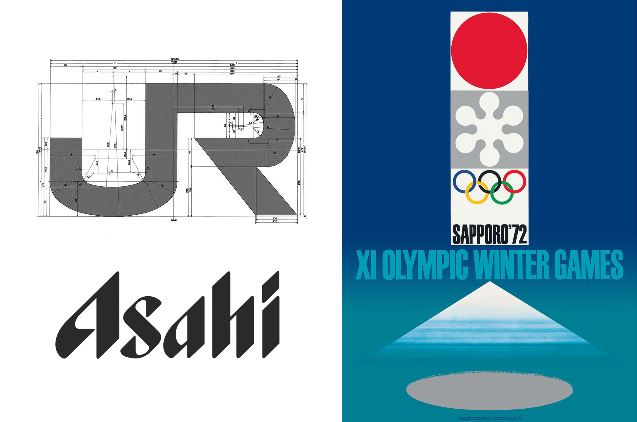
Nagai’s iconic logo design includes Japan Railways (1987), Asahi Breweries (1986) and the Sapporo Olympics (1972)
As the 1980s unfolded, Nagai’s style underwent a deep, spiritual shift. He began to favor organic, hand-drawn textures over the sleek perfection of geometric shapes, reflective of a broader cultural conversation in Japan about moving away from industrial grit and back toward ecological harmony.
Perhaps his greatest contribution was changing how businesses saw themselves: Nagai believed a logo should be a vessel for a company’s soul, not just a label. This legacy is one that continues to endure in visual communication around the world.
Related Posts
- Tsuguya Inoue: The Father of Japanese Cool
- Tokyo’s Arimasuton Building: A Concrete Masterpiece Made Entirely by Hand
- Kioi Seido: Tokyo’s Enigmatic ‘Building With No Purpose’
Updated On March 2, 2026