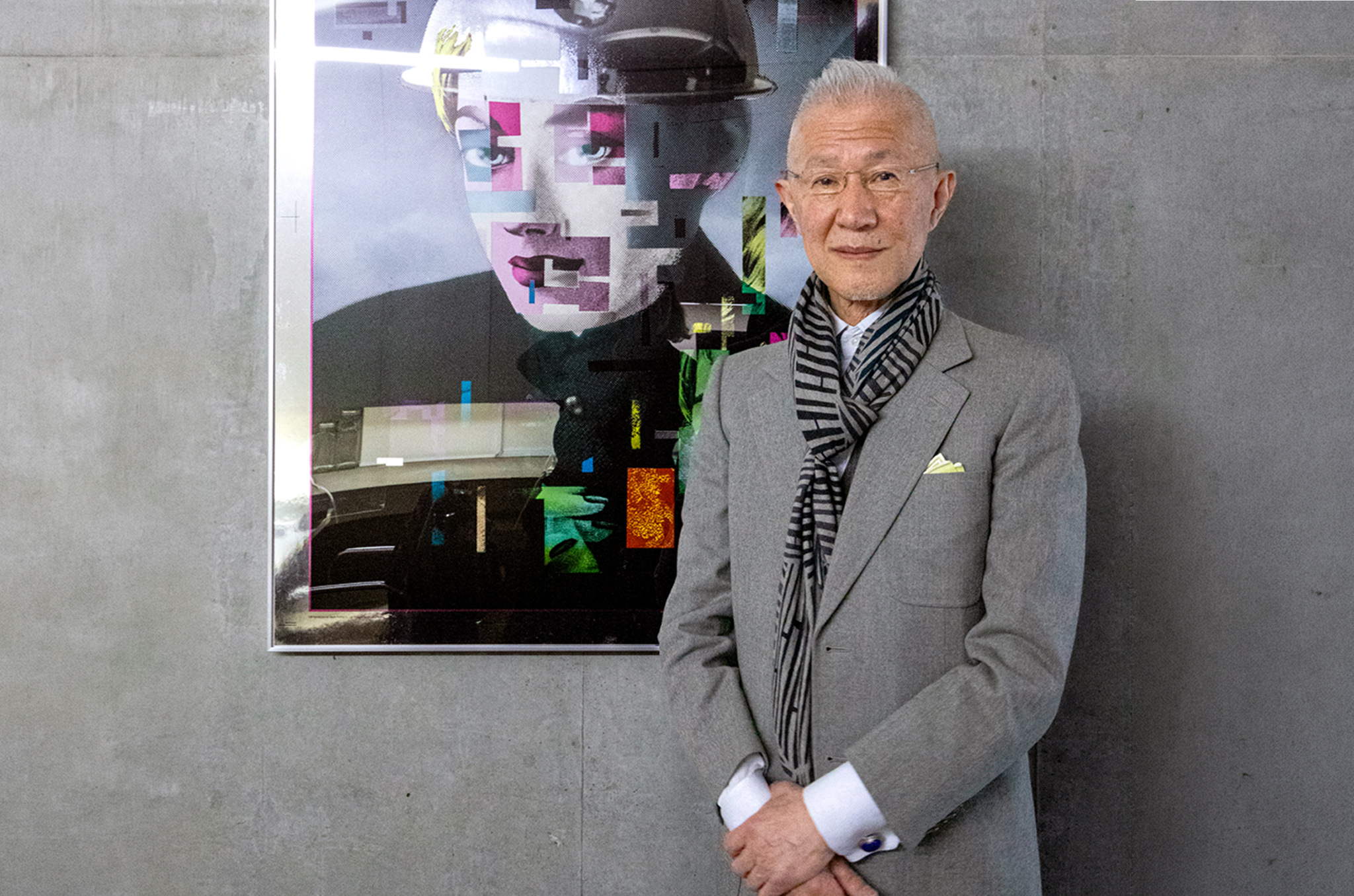
You may not be familiar with Yukimasa Okumura’s name, but you’ve almost certainly seen some of his artwork. Over five decades, he has shaped the visual identities of some of the most important artists in Japanese music history: Yellow Magic Orchestra, Ryuichi Sakamoto, Happy End, Haruomi Hosono, Sadistic Mika Band, as well as Tatsuro Yamashita and Taeko Onuki, who are widely regarded as the faces of city pop. From advertising to books and magazines to products and stage design, his reach has extended across every medium — always restlessly, always without repeating himself.
Born in Aichi Prefecture in 1947, Okumura came of age at the precise moment Japanese pop culture was finding its visual voice. After graduating from the Kuwasawa Design School — one of Tokyo’s most rigorous design institutions — he helped found Workshop Mu!!, a three-person studio that would become the birthplace of a distinctly Japanese graphic sensibility. From there, he went on to establish The Studio Tokyo Japan, now known as TSTJ Inc. — the practice he continues to lead today.
In the late 70s, he became the art director for Yellow Magic Orchestra — a relationship that would produce some of the most radical and enduring visual work in Japanese music history. Albums, posters, film, stage, commercials: Okumura directed it all, shaping not just YMO’s visuals, but also how the world perceived the group’s identity. His work on YMO’s stage design was recognized with the Tokyo Art Directors Club Award in 1982, and he went on to win the prize again in 1984, 1985 and 1986 — a remarkable run that cemented his reputation within Japan’s design establishment. And yet, outside of those circles, his name remains largely unknown, even as his images have traveled everywhere.
Now, as a new generation of listeners around the world stumbles onto the music he helped shape, Okumura’s creations are once again becoming a pop culture touchstone. He recently launched a self-initiated project called Reconstruction, in which he recreates and reimagines some of his most iconic album covers as silk-screen prints. Suddenly, the artist has found himself doing something he rarely ever does: looking back.
We sat down with him at his studio to talk about where it all began, what it means to translate sound into image and why he has never once wanted to make the same thing twice.
Yukimasa Okumura Full Interview
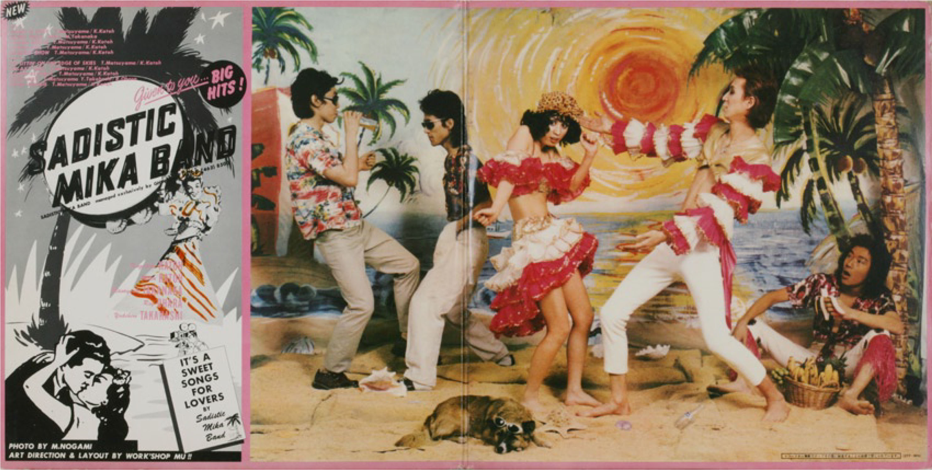
The inner album jacket artwork for Sadistic Mika Band’s 1973 self-titled release, “SADISTIC MIKA BAND.” (Courtesy of TSTJ. Inc)
TW: Your design career began in the 1970s, when Japan was heavily influenced by American culture. Can you take us back to your first design practice and those early years?
Okumura: Music was always in the house when I was young — records, all kinds of things. In junior high, the Beatles arrived and changed everything for me, though I was actually more drawn to American jazz than most of the young people around me. I liked jazz with a real beat to it, something physical. Then British rock came, and I moved toward that, too. I was never someone who stayed in one place for long.
The visual side of things started around American military bases. At Tachikawa, at Yokota — those areas had accumulated decades of American printed material. Magazines, catalogs, advertisements from the 40s and 50s, just piled up in storage. We’d find them, buy them, bring them home and cut them apart. All of that American typography and graphic energy became our material.
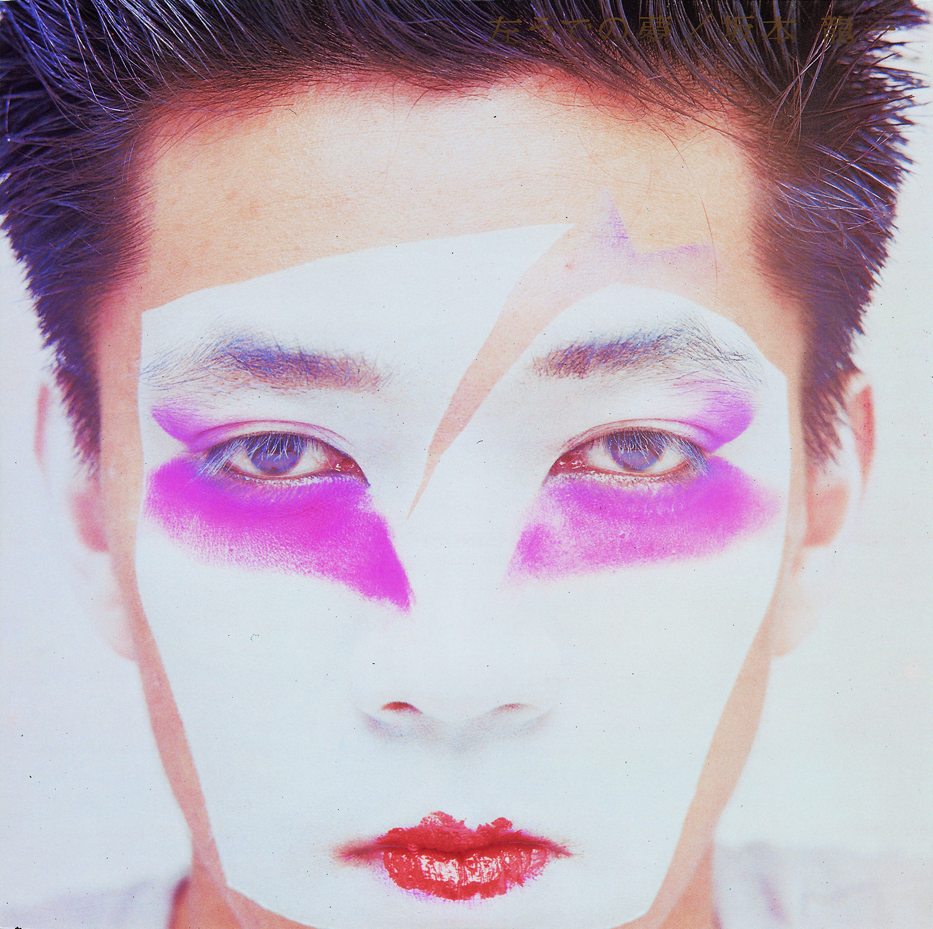
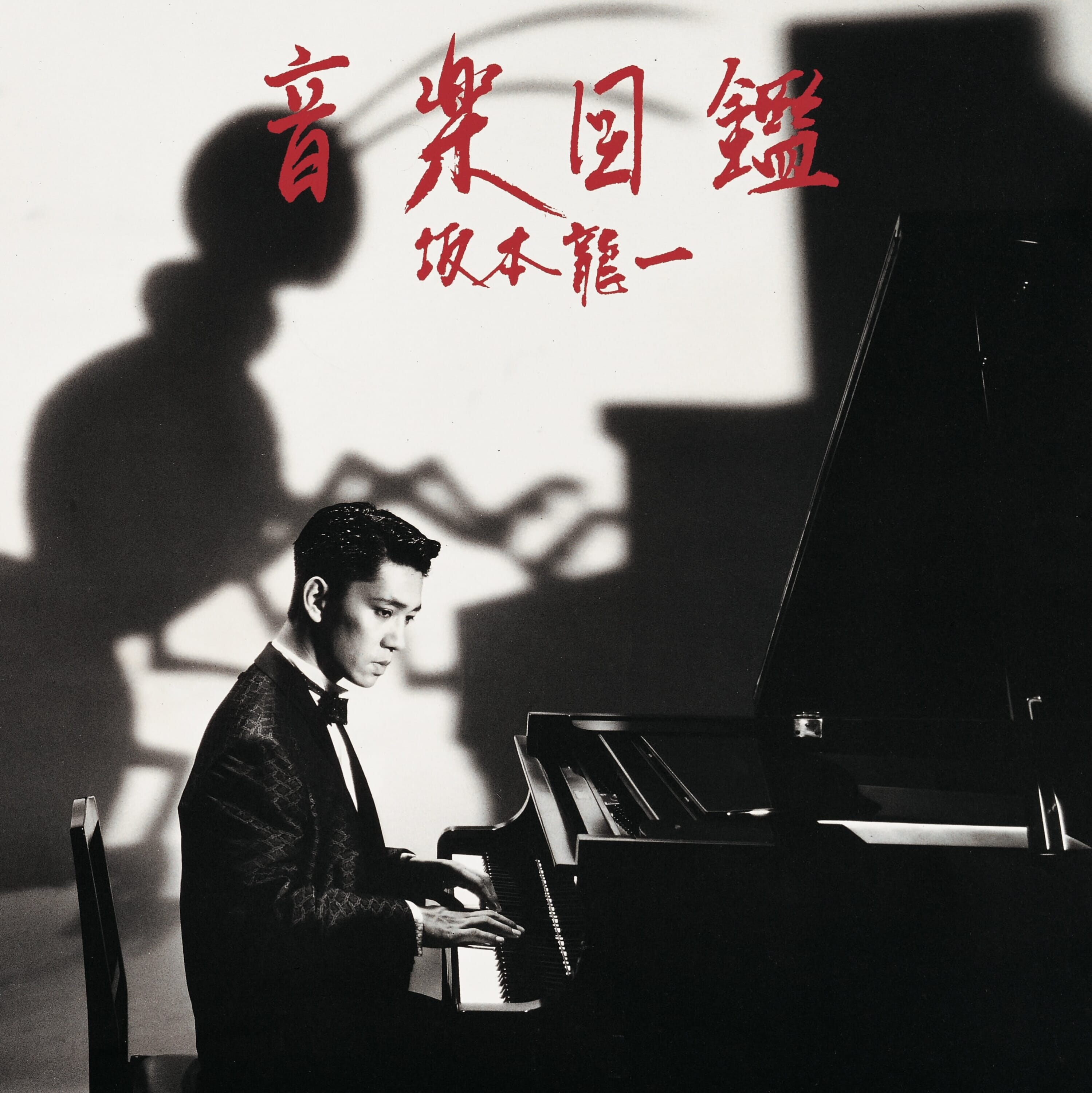
The works you made for Happy End, Sadistic Mika Band and YMO are now considered foundational to the visual language of Japanese rock and techno-pop. Were you conscious at the time that you were building something completely new?
I don’t think in those terms, honestly. Each job was its own problem. With Happy End, the question was simply: What does this music look like? They were making something that felt rooted in Japan but was coming through a completely American lens — the sound, the influence, all of it. That tension was right there to work with.
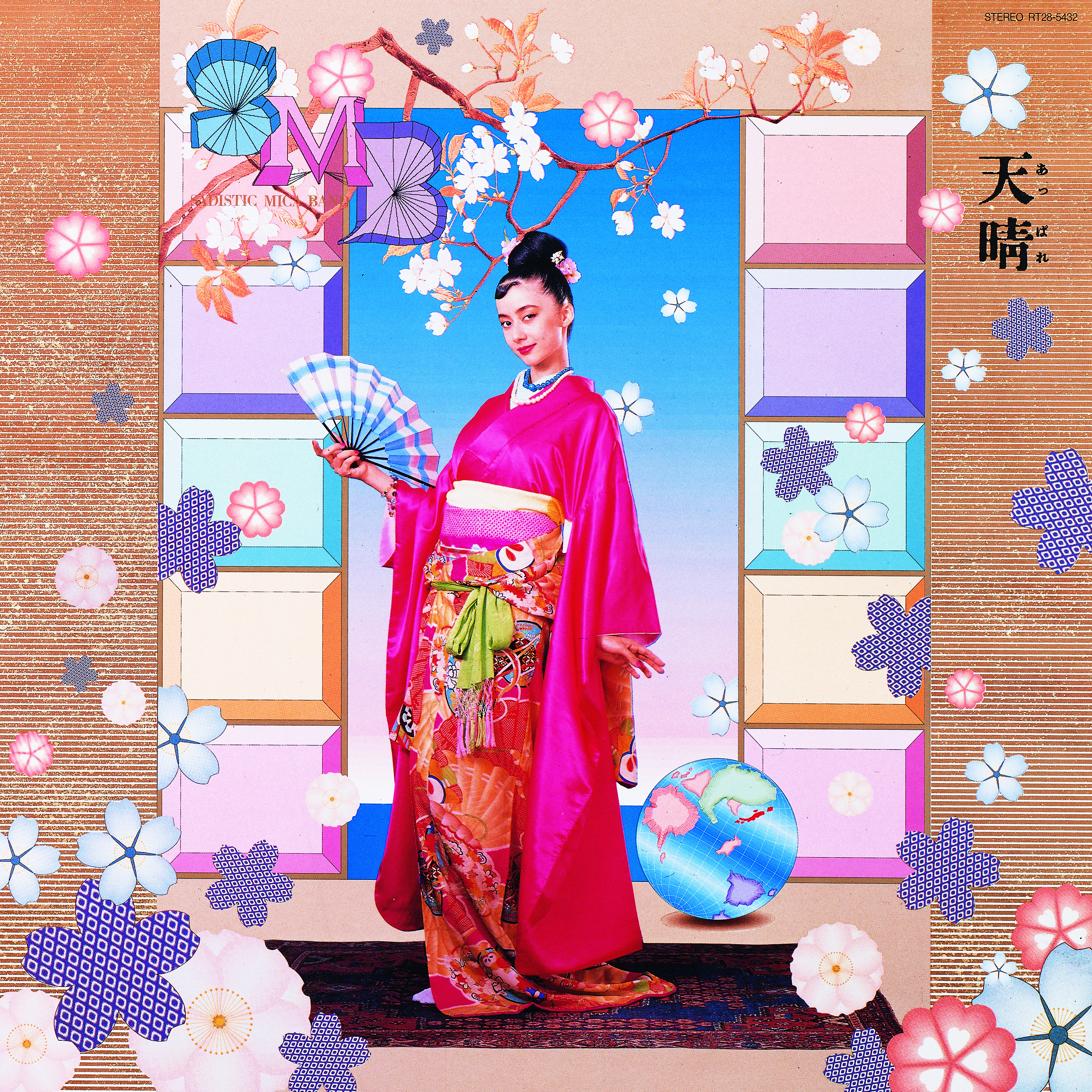
Sadistic Mika Band was different. Kazuhiko Kato had this energy that was almost theatrical, very international in its appetite. The tropical imagery on the jacket [of the group’s self-titled album] — there was no precedent for it in rock anywhere in the world at the time. When it came out in Britain, it made a real impact. People didn’t know quite what to make of it, which was exactly right.
YMO was the most extreme case. By the time I was brought in, the band was enormous in Japan, and the members were completely trapped by that. They had a million fans who expected continuity, but what they wanted was the opposite. They told me: Deny everything that came before. No new photos, no connections to the previous work, no YMO colors! They didn’t even want to pose for new photographs, so I ended up taking them myself, covered in face paint, as an act of rebellion. They gave me free rein over everything.
I was searching through the huge pile of cuttings in my office — I’d been collecting American magazines — looking for something as far from YMO’s image as I could find. And then a 1960s toothbrush advertisement caught my eye. I copied it in watercolors in a few hours. There was another option — a clipping of a man spreading butter on bread, very ordinary, very everyday — and it came down to those two. Eventually it was the toothbrush. All three members agreed immediately.
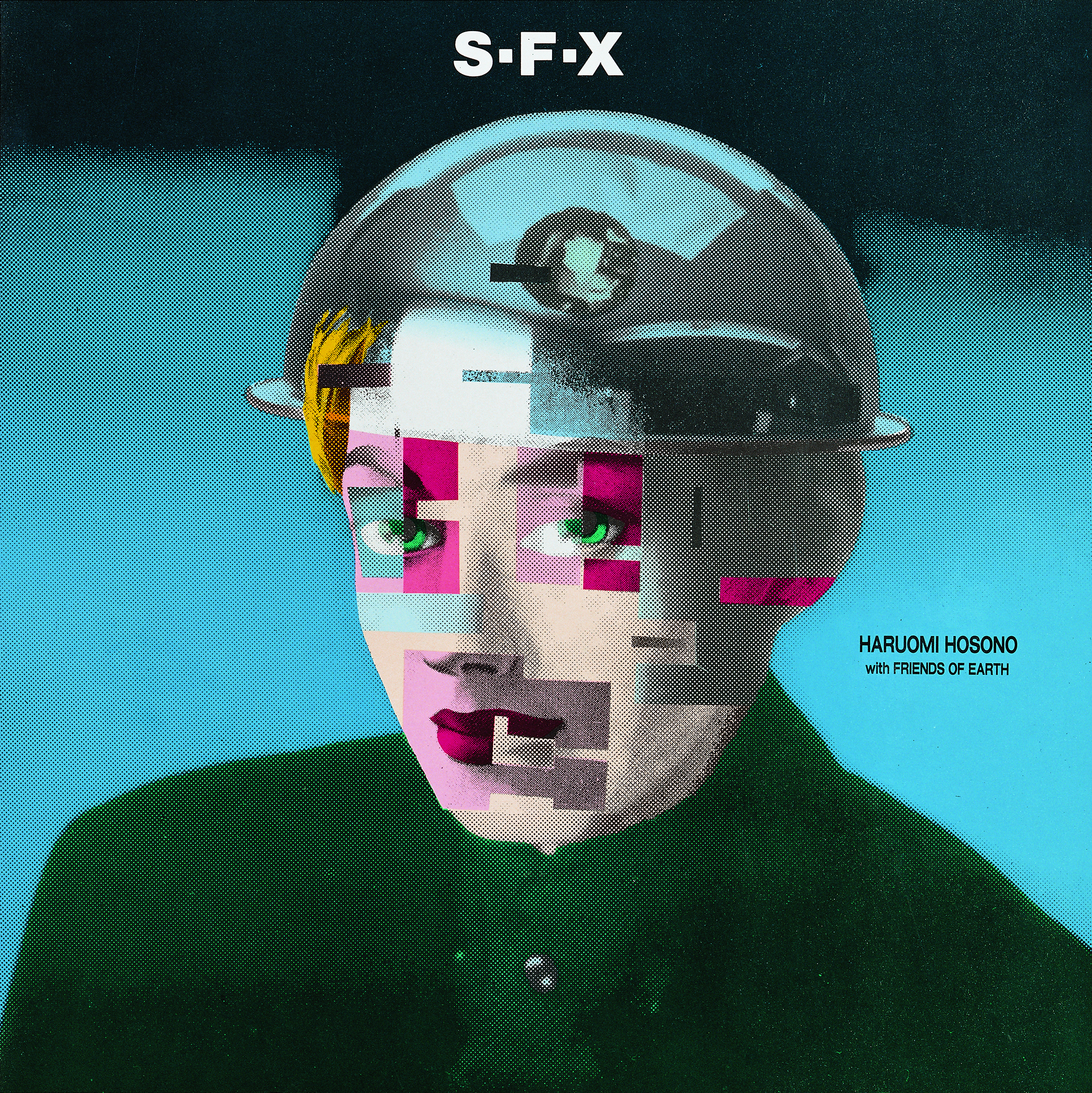
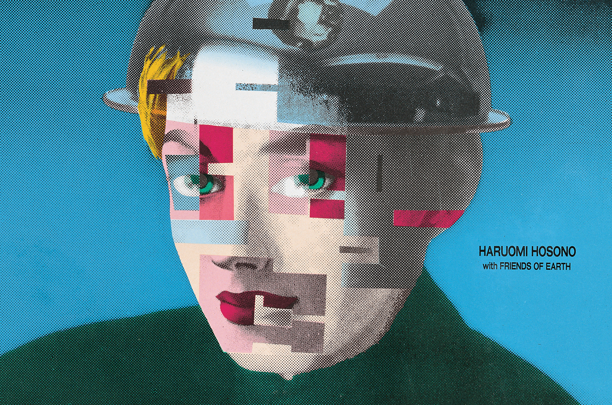
Poster design for Haruomi Hosono’s 1984 release, “S-F-X.” (Courtesy of TSTJ. Inc)
You’ve spoken about how your work looks like it was made by many different designers with no consistent signature. Where does that come from?
I think it is a very Japanese thing, though it took a long time for people to understand it that way. In the West, and I heard this for many years, the expectation is that a designer has one identity — one style, developed and refined across a career. If you don’t have that, the conclusion is that something is wrong. I was told for a long time that my work was inconsistent and problematic, as there was no clear identity.
But I never thought of it as a problem. I always thought of it as the practice itself. In Japan, we move between religions. Buddhism, Shinto, sometimes even Christianity … We hold many philosophies at once without contradiction. I think the same is true of how a Japanese designer might work. You don’t have to resolve everything into one statement. You can be many things across a lifetime.
What I do is close the lid. Every time a project is finished, it’s finished. I don’t look back at it, I don’t try to improve on it, I don’t carry it into the next thing … I think, “That’s enough,” and move on.

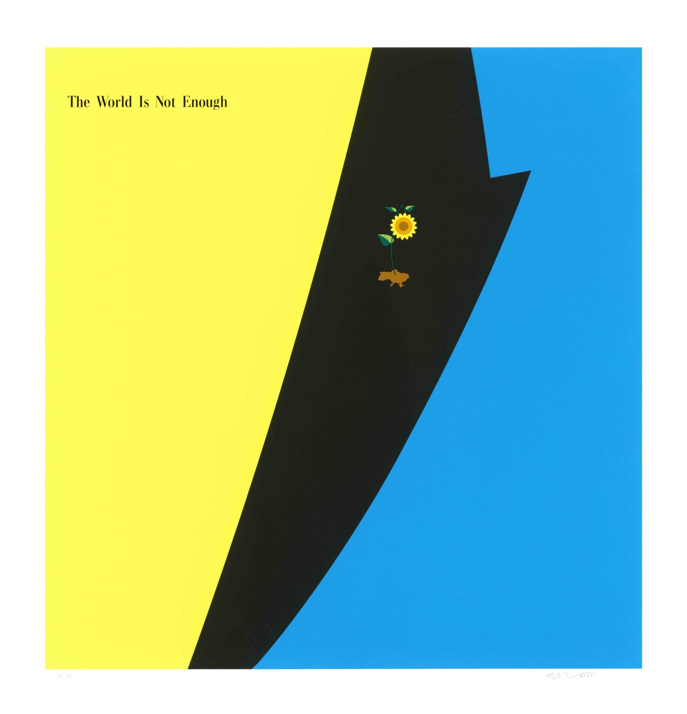
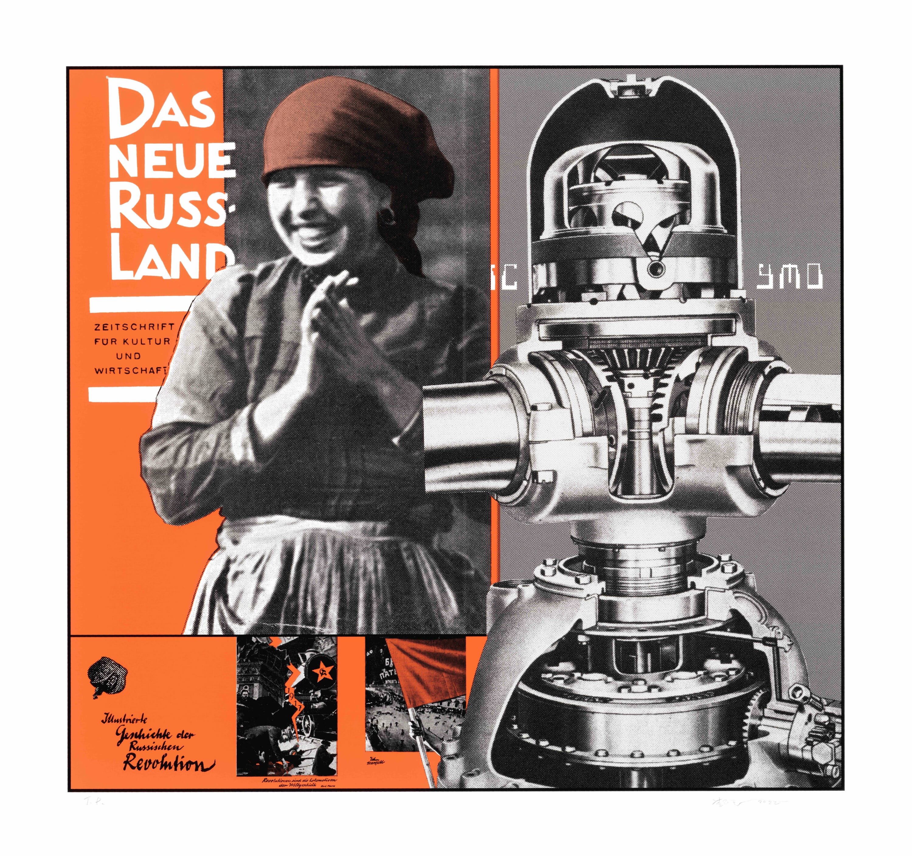
Your current project, Reconstruction, sees you returning to those iconic sleeves through silk-screen printing. What drew you back to the originals?
I don’t look back very often. Things go into the archives — I have quite a large storage space — and they stay there. But age changes things. I’ll be 80 next year, which is genuinely difficult to believe. When you get to that point, you find yourself opening lids you closed a long time ago, looking at things with fresh eyes.
With Reconstruction, the works stay very close to the originals. The sleeve I made for YMO’s BGM is essentially as it was — I added polka dots and a new onsen mark because I wanted to bring some texture, but the image itself is intact. The silk-screen process was important. It’s slow. It’s physical. It produces something with a surface you can feel. That felt right for work that was always about the tactile — the weight of vinyl, the grain of the printing, the specific quality of ink on paper.
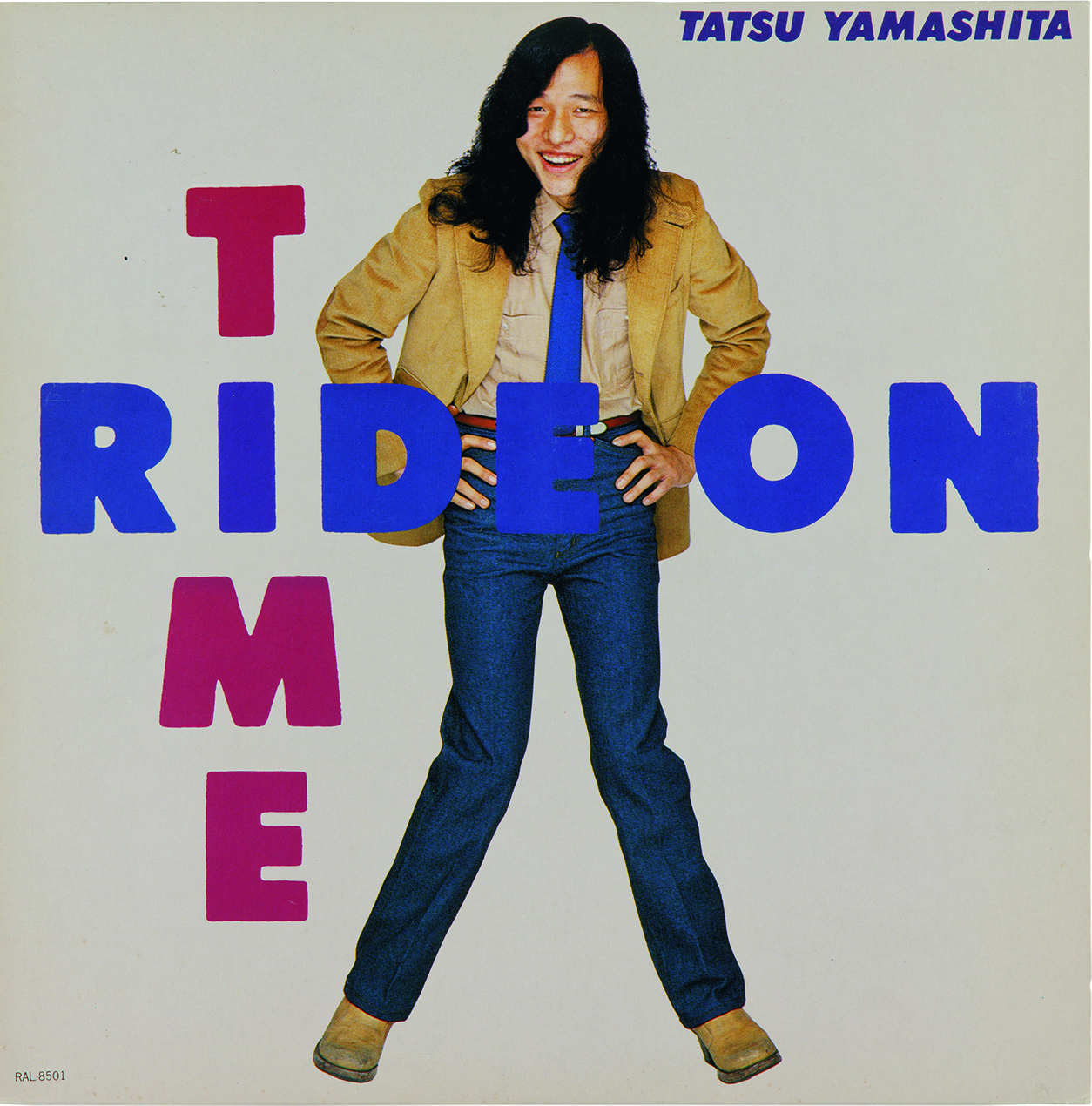
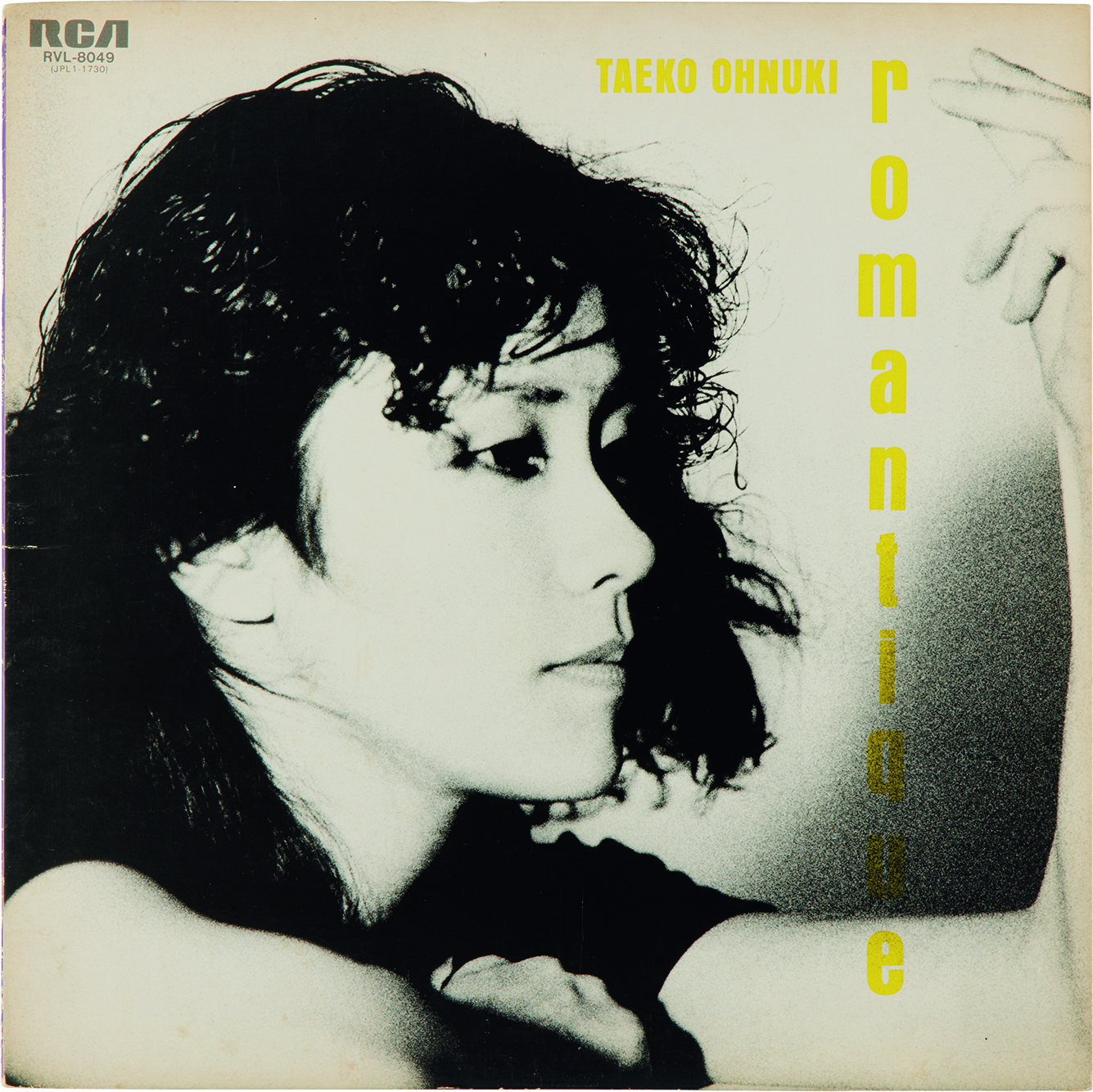
The music you helped shape is now being rediscovered by a whole new generation of listeners around the world under a new umbrella term called “city pop.” How do you feel about this new trend?
It’s interesting because I was there when all of it was being made. Mariya Takeuchi came up through Kazuhiko Kato’s circle — she was found at an audition of some kind. Tatsuro Yamashita, Taeko Onuki … they were all in the same orbit, sometimes in the same building, talking about making new sounds. And I was inside that, making the images. At that time for me, it was just work.
What I notice now is that people are drawn to the texture of [city pop]. The way those records were made — the analog process, the physical quality of the printing, the fact that everything was done by hand or by a machine that took a full day to render a single moving image. There is something in that material reality that people seem to feel, even when they don’t know what they’re feeling. Maybe a sort of warmth or weight?
I also think there is a certain image of Tokyo in those records — something aspirational, a city that felt full of possibility — that no longer exists quite like that. And perhaps people are mourning it a little, even if they never lived it. That is not a bad thing to mourn.

More Info
Graphic Works of Yukimasa Okumura, published by Graphic-sha (2023), is available online and at select bookstores. Discover more of his work at TSTJ, his design practice.