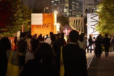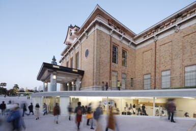

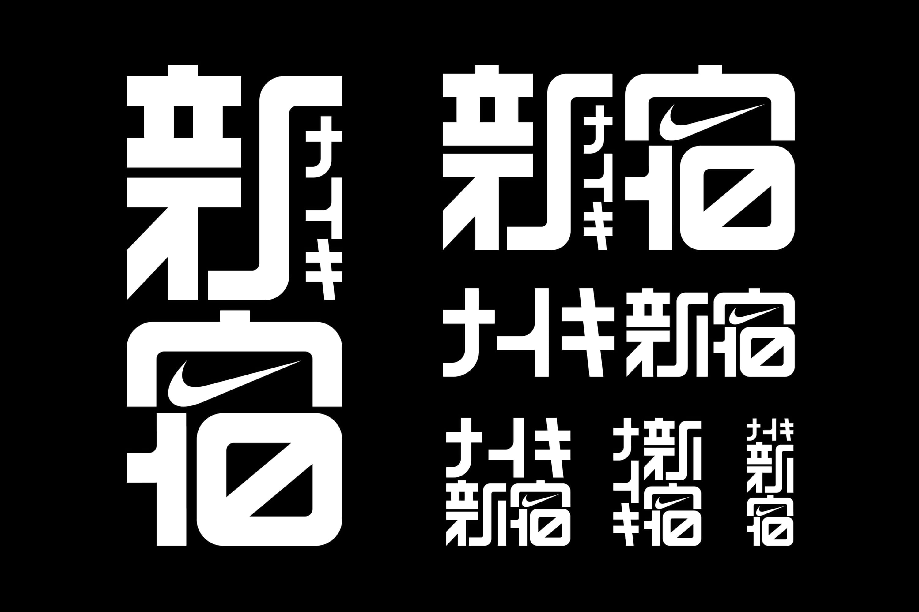
Nike opened a new four-story flagship at the East Exit of Shinjuku Station on April 10, anchoring its presence in Tokyo’s busiest transit hub. The store’s logo, rounded kanji characters for “Shinjuku” with the swoosh tucked into the final stroke, comes from an unlikely source: Shuetsu Sato, a 72-year-old security guard whose handmade duct-tape signs have guided commuters through the station for more than 20 years.


Shinjuku Station’s Unofficial Font
Sato has worked overnight security at Shinjuku Station since 2002. Two years in, as the station entered a long stretch of renovation work, overwhelmed passengers kept stopping him for directions. Wanting to help these frustrated commuters, Sato began fashioning letters from leftover construction tape and mounting them on scrap panels to create large, unmissable signs.
A native of Hanamaki, Iwate Prefecture, Sato had never studied design and has admitted he was bad at calligraphy in school. But a high school art class introduced him to Gothic lettering, and its clean lines stuck with him — an aesthetic that would later shape his handmade work.
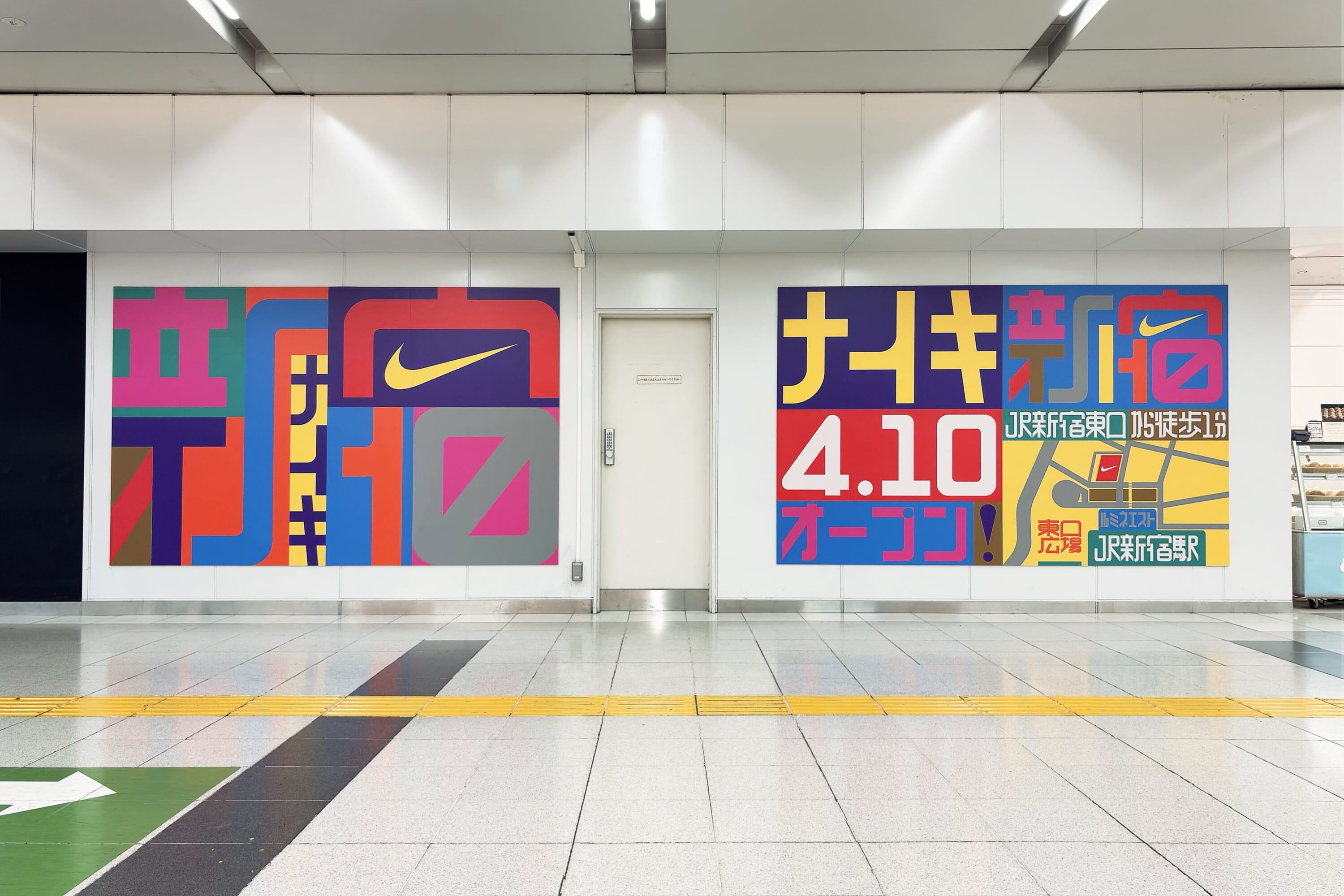
He works freehand, without a draft, laying tape down in a grid then carving out each character with a utility knife. The results are unmistakable. Thick, plump kanji and kana with softly rounded corners to comfort the harried commuters, featuring evenly weighted strokes and a hand-cut warmth that no digital typeface can match.
At once nostalgic, retro-inspired and futuristic, the characters slowly built a following as “Shutetsu-tai,” or Shuetsu font. Last December, the Japan Sign Design Association awarded Sato with a Platinum Honorable Mention for his “creation of pathways.”

From Station Walls to Storefronts
Among the font’s longtime admirers was Shun Sasaki, a graphic designer who first encountered Sato’s tape signs in a station more than a decade ago. When Sasaki was tapped as the art director for the new Nike store’s branding, Sato was the first name that came to mind.
Sato was hesitant at first, in disbelief that a global brand would want to feature his letters made of gum tape. Once on board, he cut tape versions of the characters and recut them by hand as Sasaki suggested digital tweaks, working back and forth until the logo took its final shape.
You can spot the logo on the exterior of Nike Shinjuku, a four-floor space at the FF Building just off the East Exit rotary. The store is structured as a layered experience that moves from performance to lifestyle as visitors climb. Throughout, signage borrows visual cues from Tokyo’s subway system, tying the space to the infrastructure that surrounds it — with Sato’s lettering as its most local touch.
Japan’s Handmade Type Tradition
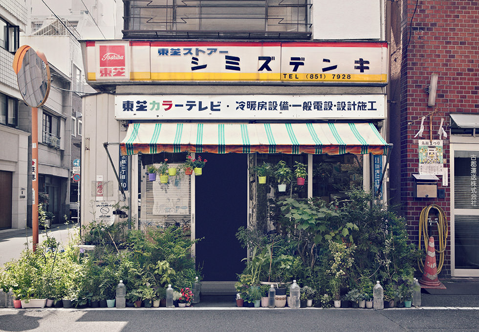
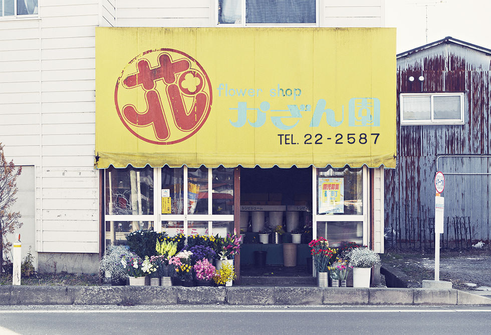
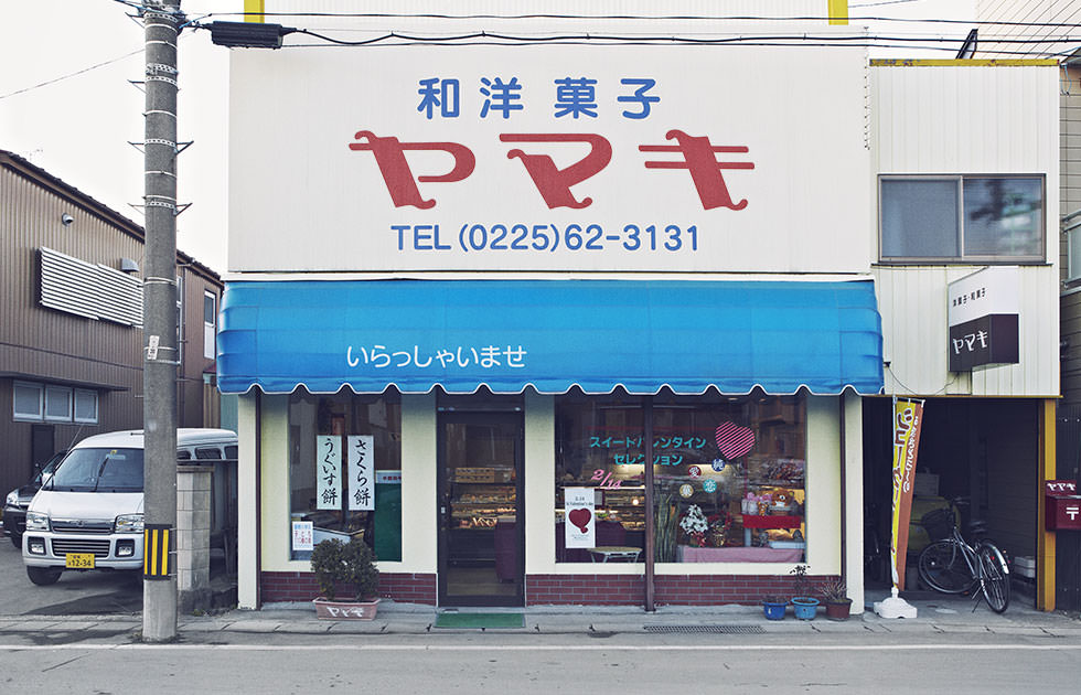
That local touch carries more weight than it might seem. Sato’s path isn’t entirely without precedent — Japan has an enduring tradition of championing handmade, vernacular lettering, often the work of shopkeepers and laypeople rather than trained designers.
For instance, take the Noramoji Project, a name combining nora (“stray”) and moji (“text”), started in the early 2010s by a trio of designers who catalog and digitize the hand-painted fonts of aging Tokyo storefronts. The project celebrates the artistry behind the facades of barbershops, florists, toy stores and beyond, each with its own idiosyncratic characters drawn by owners with no formal training.
What draws people to these fonts is the same thing that draws them to Sato’s signs — slight irregularities, distinct character and a human touch. Placed in this context, Sato’s tape-cut kanji aren’t necessarily an outlier. They embody an attitude that runs through Japanese design: that even something as utilitarian as a sign is worth making with intention and care.
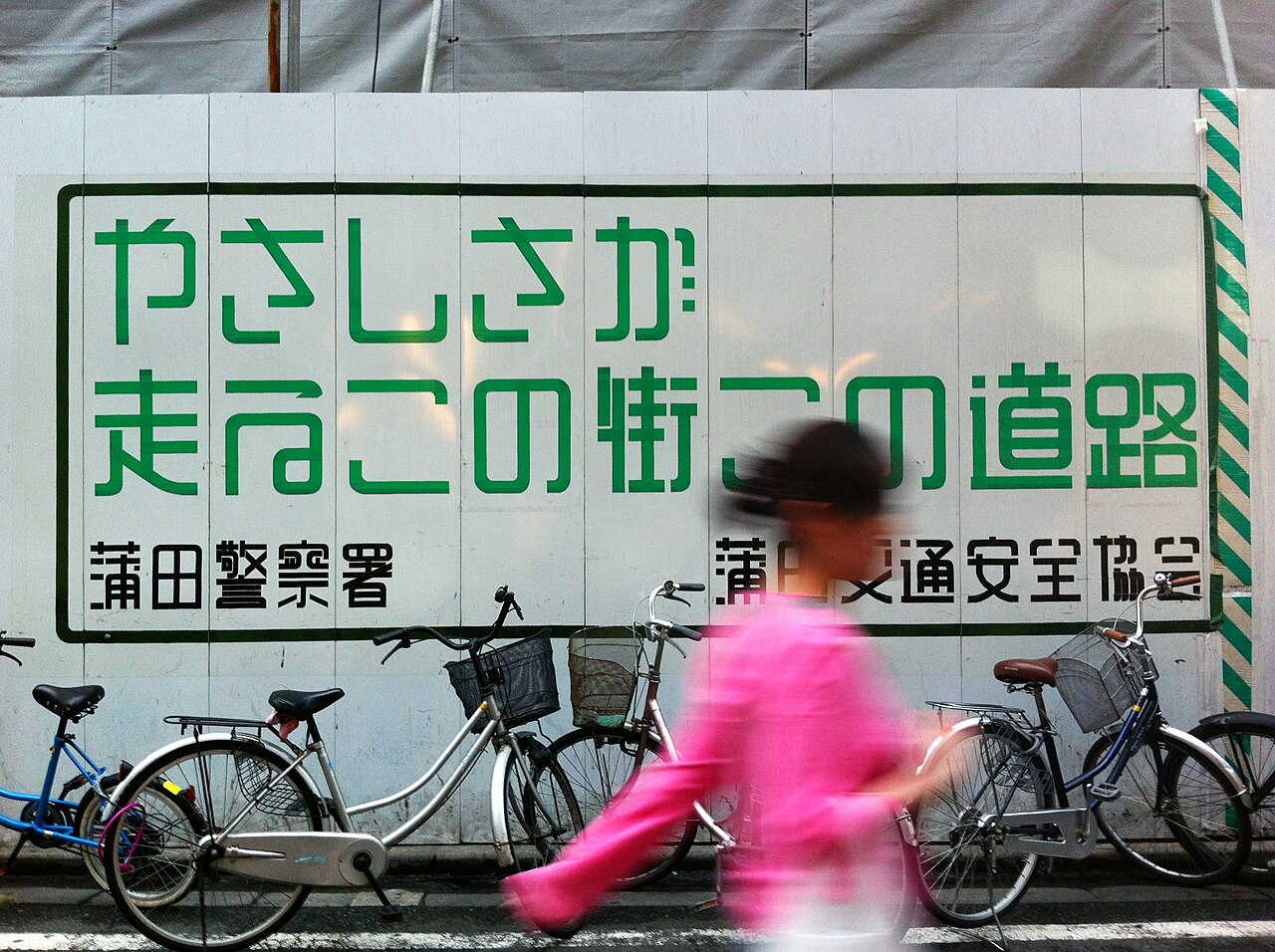
an example of shuetsu font, via wikimedia commons