Another day, another concern about “preparing Japan” for the 2020 Olympics, this time coming straight from the desk of Geospatial Information Ministry of Japan (GSI).
Earlier this week, GSI released an updated chart of common symbols used on information boards and maps across the country.
Eighteen symbols, six of them more significantly than the others, have been revamped to reflect more universal – ahem, politically correct – representations to appeal to visitors who have supposedly been baffled by Japanese maps for a number of decades now.
To prevent hoards of tourists from getting lost in the myriad of “3-chomes” and a network of Christian iconography (the hospital image now depicts a thicker “+” inside a wide building outline), GSI solicited foreigners in Japan for opinions on which existing symbols to keep, and which need to go.
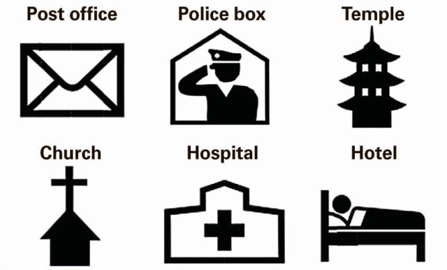
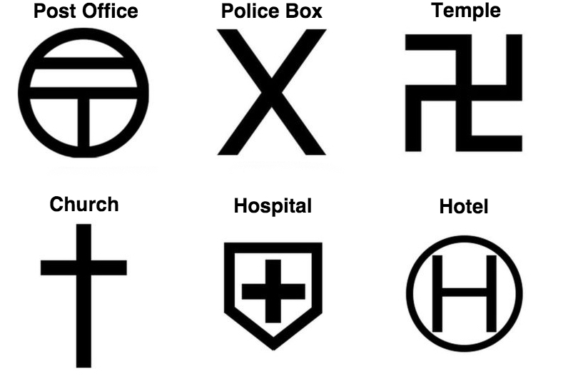
Let’s start by taking a look at these six original designs:
In general, GSI determined how best to present natural landmarks, from mountains to rivers, re-work names for temples and shrines, and list Japanese addresses in a more straightforward manner. Part of the process included ensuring the icons retained both their details and meaning when they were shrunk to the size of ant portraits, forcing them to remain succinct.
A good part of the reason for the updates is to benefit tourists in the lead up to, and during the week-long fling that is the 2020 Olympics. However there are a few heavy hearts mourning the loss of a unique and quirky aspect of Japanese culture and way of doing things, solely for the sake of becoming a more globalized and accessible, if homogenous, society. If there is pressure to make vacations in Japan more comfortable for travelers, perhaps there should simply be more literature made available on the history, key, and reasons behind the symbols as opposed to a make-over. The trend to adopt popular symbols across the ocean will likely continue up until, and beyond, the 2020 Olympics. To what extent remains to be seen. Just as “emojis” expire to allow more hip ones to emerge, so do markers on maps.
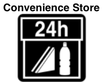
As you can see in the image of the six new symbols at the top of this post, GSI decided to do away with the “helipad” icon and opting for a person in a bed to signify hotels and inns (albeit, now misleading for capsule hotels and ryokans), and stick the cross atop a building, to clarify the difference between a cemetery and a church.
It’s important to note, however, that these particular icons will only be changed on “foreigner” and tourist maps, while preserving everyone’s favorites – from that double-topped “T” for post offices to the ancient Buddhist swastika – on Japanese boards and maps.
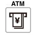
We still aren’t sure why they insist on overcomplicating the symbol for ATMs, or why they didn’t seize the opportunity to swap the “conbini” sandwich for an onigiri (or just the 24 hour reference).
Announced on the morning of the January 21, the transportation office also declared that they are replacing the red “止まれ” (“tomare”) road signs with the standard Western “STOP” signs.
Design-wise, the “koban” (police box) image was the most debated, before they settled on a box containing a saluting officer. That seems to be a bit easier to convey than depicting an officer requesting to see your visa, despite its slightly militaristic demeanor. There is also a smattering of debate rippling through the Twitter-sphere that many people never even notice the original “X” (two batons crossing) that denoted police box to begin with. At least now they stand out a little more and pirates won’t be disappointed at the lack buried treasure.
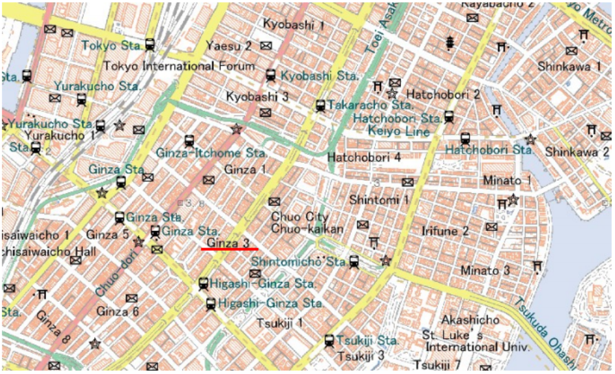
To preview what new informational maps may look like, it appears there will be a sea of envelopes, district and neighborhood numbers, trains, arches, and “Sta.” for stations (the stars were a dry-run for police boxes).
Unfortunately there will still be a few missing features like a compass symbol and a proper distance scale, both of which would at least help prepare those going on foot. To our chagrin, information boards will also continue to be devoid of icons for banks, parks (besides the blocks of green), famous landmarks, campsites, schools and universities, libraries, malls, and precise locations of Mexican restaurants. OK, maybe that last one is more of a personal gripe…
Long live the trusty onsen/miso soup/dead jellyfish symbol.

–Natalie Jacobsen
Images courtesy of GSI.
Updated On July 18, 2017