If you’re a big foursquare user, you’ve probably managed to hit “mayor” status once or twice, and check-ins are part of your daily routine. But have you ever thought about what all of that activity looks like, when everybody is doing it? Over the space of a year?
Given that there are some questions as to how popular foursquare is, you might wonder how much activity you might see, or how global of a platform it really is.
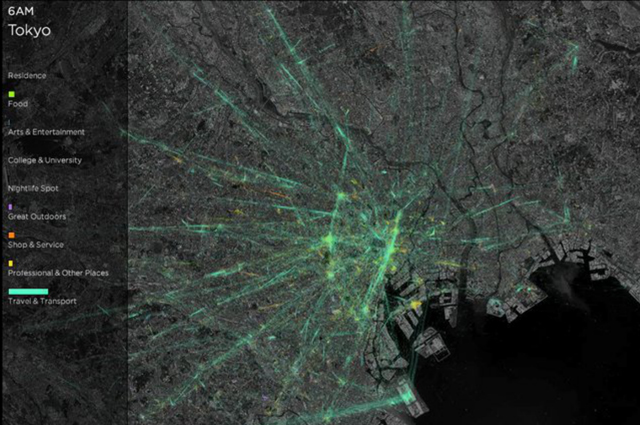
The fact that the service has seen 4.5 billion check-ins shared by 40 million users around the world dispels any doubts about popularity, and foursquare has created a time-lapse visualization that shows the movement of its users in various cities around the world—including Chicago, London, New York, and Tokyo.
Instead of taking one day’s worth of data, the number crunchers at foursquare have compiled a year’s worth of check-ins, ratings, and mayoral contests for each city’s locations. What you’re left with is a video representation of human movement that is no less intriguing than the multicolored liquids of Tokyo Arteria, but perhaps even more impressive in its scale.
Of course, unlike the visualization of the movement of the Tokyo subway system, this kind of data is also very important for following the patterns and habits of consumers, as the colors of the check-ins (blue for night spots, for example, and yellow for workplaces) reveal a wealth of data about habits and trends. Either way, it’s one more perspective on our mass movement around the world’s major cities.
Tokyo is below, followed by London and New York.
Foursquare check-ins show the pulse of Tokyo from Foursquare on Vimeo.
Foursquare check-ins show the pulse of London from Foursquare on Vimeo.
Foursquare check-ins show the pulse of New York City from Foursquare on Vimeo.